RAP’S
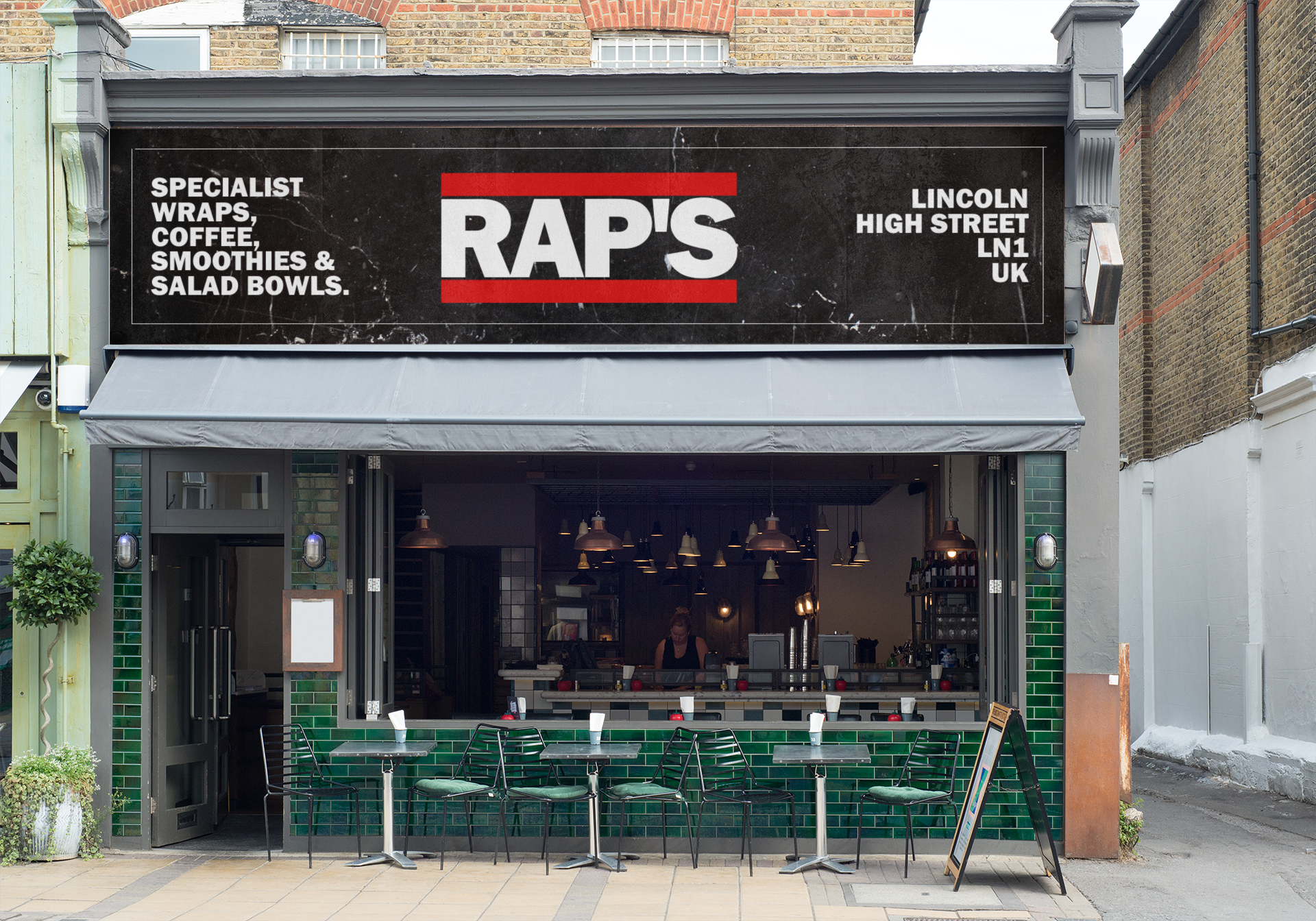
Branding concept for a pilot scheme in Lincolnshire. Rap’s is an Urban cafe specialising in healthy wraps, smoothies, salad bowls and coffee all based around the 90’s NYC era.
In 2021, Matt Alexander reached out for ideas on an upcoming projects which was backed by investors.
Being a foodie & 90’s rap fan, this project was right up our street and what we came up with definitely caught the eye.

Branding
Dark, gritty feel to the background reflects the 90's NYC vibe. Very contrasting with the red shining through. The red colour used originally in the Run DMC logo , takes people back to that era.
The strong red borders symbolise the structure of the restaurant with the most important thing being inside in the middle (the customers).
Font | Franklin Gothic Heavy
Colours | Crisp White, Sharp Red & Dark Marble


